Dynamic Gender Reporting in Dashboard

After installing the MoreGenders component I found the Dashboard not entirely useful.
The related classes and library are male/female oriented.
I modified them to retrieve a list of genders from the database and populate the dashboard graphs dynamically according to what's in use rather than hard-coding genders.
I've created a patch, but don't know where to send it for the core development team to evaluate or whether to just post it here?
Any suggestions?
[Topic is Close]
Your request wasn't confusing.
Your second observation about colours being different between the two graphs should be easy. It will be fixed by solving the first problem.
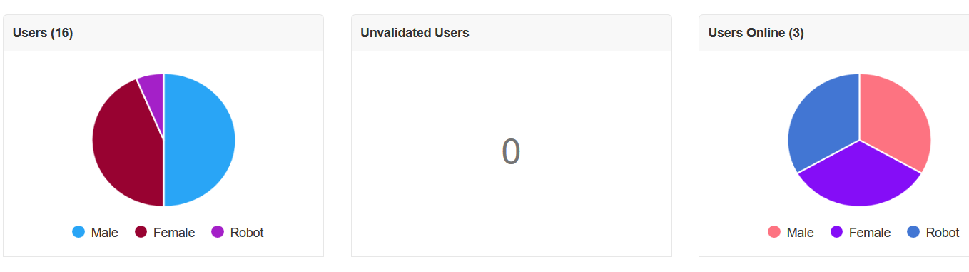
The problem for me is that the number of genders, and what they might be named, in the database is variable.
I've just thought of a 3rd approach that should be easy. I'll smash it out later today.


Hmm ... maybe my request was a little confusing ...
What I wanted to say: With the old code we got only 2 colors AND these colors never changed.
So I got used to know: let's say females are pink and males are blue.
With your code colors are always different, so I might get pink for females one time, but the next time females may be blue. And that feels irritating to me.
Even more, when - as shown on my screenshot - males appear blue on the left graph but pink on the right one.
What I wanted to achieve was knowing with just one look ... ah ... the majority of currently logged in members are males - simply because I remember the color. Right now I always have to sort out first who is who.
I can think of two possible solutions right now:
- Add the more common genders to the registration form/user page, assign colours to them in the dashboard, then default to grey for later (third-party) additions - or
- Use 2 alternating colours, so they may repeat, but would visually break up the data in the pie graphs
Thoughts?
Just applied your patches: Great work Shylo!
There's two cosmetic changes I'd like to ask for, though. To me it appears a little irritating to see
- different colors each time I open the dashboard
- different gender colors on left and right graph.
No other issues so far. A big thank you.
Oh. That's what gist is... awesome. Here's what I came up with.
https://gist.github.com/shylohana/05d1f92d77482b0dd8a6746b2fdd3264

Yes you can provide pull request or paste code here : http://gist.github.com/
Ok... had to mess around getting into Github.
I've never used it before.
Should I just create a pull request, or is there some process I should follow?
Sorry about the newbish questions
You can use gist.github.com or GitHub.com
Well - I tried posting the patch file here as a code block... wouldn't post.
Github, it is, I guess.
You may provide code here or better on GitHub?
Due to the many requests in the past for additonal features and components we have decided to develope a premium version. Features like Hashtags, Videos, Polls, Events, Stories, Link Preview, etc included in it.
 $199 (Life Time)
Learn More