Attention OSSN v4.4 GUI, feedback required

Hello Members, We are working to improve GUI, we are thinking to do following with goblue theme:
- A sidebar (black one) always open by default.
- A chat with long list on right side of page should have small width, only shows a large user picture only and no names.
Please let us know what you think... the decision shall be made as per your replies.
Thanks


Curt,
would you mind to explicitely name the "good things" you were hoping to come?

I don't follow crowds so I am more than sure that my response will not be popular. I was really hoping for good things to come...my first mistake. I installed 4.4 and I find a lot that I do not care for. The interface is cumbersome and awkard. When you expand the bar on the left the icons on the top bar migrate off page. It is pasty looking. It is visually unappealing and difficult to read. It is unintuitive. The comment system seems to always be a step behind. Seriously, I did try to find something that I did like about the new version, but in my opinion it just keeps sliding downhill. It is good in theory, however it appears to be left behind in the dust of other social networks available.
My apologies for such a negative sounding response, however these are my honest and true feelings about this new version. As a programmer, I am sure you understand you will always get some positive and some negative feedback. If you did not take all options into account you would be shortchanging not only your customers and users but also yourself.
In all seriousness, I wish you well with your endeavor with OSSN. I support you in your efforts even though I cannot in all honesty utilize your program in it's current state. I have to also take into account my customers and what they will or will not use.

- i think you should make small name bellow the picture. it will help to find someone who use random profile pict. and please make it order by online to not online.
Hi Claus, thanks for your reply, the sidebar on mobile or small devices will be closed by default. However it will be open for larger devices only.

1.) Most of my clients use normal pc with 1920*1080 Resolution. I would like to see the sidebar open by default. But on mobile devices?
2.) The chat is seldom used on my site. It would be ok for me when it would be smaller.

[Comment Deleted as off-topic $arsalan]
Due to the many requests in the past for additonal features and components we have decided to develope a premium version. Features like Hashtags, Videos, Polls, Events, Stories, Link Preview, etc included in it.
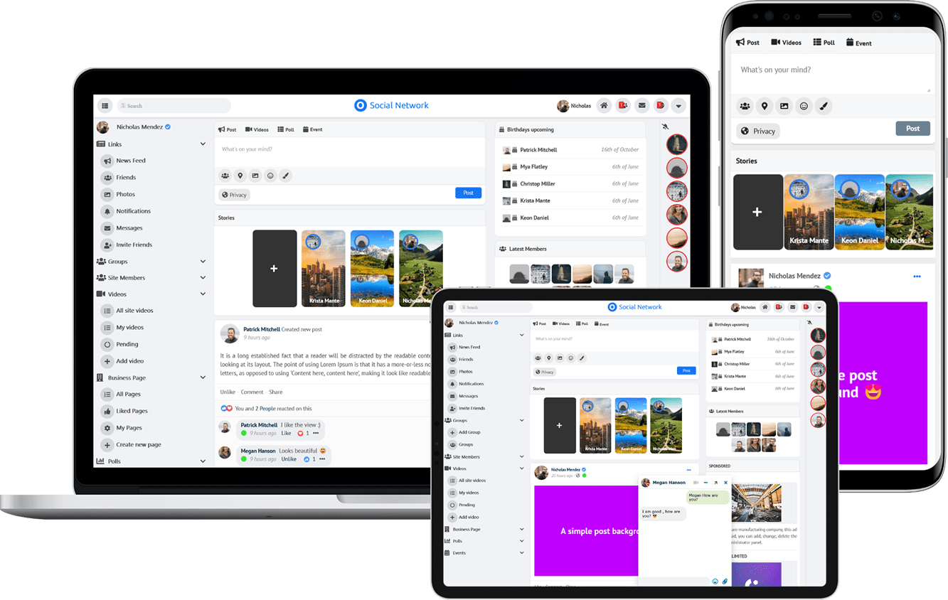 $199 (Life Time)
Learn More