
 Michael Zülsdorff
4 years ago
Michael Zülsdorff
4 years ago
A simple responsive theme optimized for mobile usability, featuring ...
Michael Zülsdorff
Replied 4 years ago
Hi Ranjan,
I was able to implement your latest suggestions into 1.16.
Instead of blowing up the Personal section with dozens of seperate group entries, GreenByGreen exclusively comes with its own "MyGroups" page now, listing all your own groups and groups you are a member of. In the latter case the group owner gets displayed. Actually this kind of code shouldn't be part of a theme, but I'm looking forward it'll be made part of OssnGroups in the future.

Well, Now the components are required to be more flexible rather than hard coded.
Michael Zülsdorff
Replied 4 years ago
Well, no bad idea ideed.
But difficult to achieve. Because all changes you mentioned are not theme related, but component related. That is:
1. it would need a change in the Blog component to display a button instead of a text link
2. Ossn themes basically only define the place (left column in this case) where to display menu entries, while the entries themselves are dynamically generated by the corresponding components.
Thanks Zetman for fixing those issues, In this theme I felt two more places of Improvements
1. On the all Blogs page, I fell there should be a button for the Sort by members / Short by date rather than a simple text.
2. It would be nice to relocate the position of my Blogs and the names of the Joined Groups in the Personal sub menu as shown in the following figure...
Michael Zülsdorff
Replied 4 years ago
Thank you for your feedback Ranjan.
Actually, with 1.14 I implemented a wrong check for content availability in the right sidebar.
I have fixed that and installed V 1.15 at your site. It's working correctly now.
I followed your instruction but it didn't work for me
Michael Zülsdorff
Replied 4 years ago
Okay, in order to crosscheck
Just did it that way and it's working for me. If your site looks different, add a demo account and I'll try to verify the issue tomorrow.
For me the sidebar is not working with version 1.14 on desktop, I tried with two different browser firefox and brave browser, but no luck.
Michael Zülsdorff
Replied 4 years ago
I agree that the friends column is too wide, but instead of changing the row view I decided to add a right column to these kind of pages.
Simply because the inner content structure is being controlled by core Ossn and can't be re-arranged the easy way and without breaking compatibility.
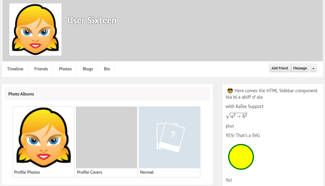
Feel free to make use of this new extra column by adding something to the HTMLsidebar component.
Thanks Zetman, for fixing this issue, I thought it might take few days but fix was quick, but this time I came up to suggest few improvement:
1. The friends list and Members list does not looks good, it's using a lot of space to show the names in row wise, so i suggest this can be improved as shown in the following image.
2. Moving the buttons in the above page as shown bellow
3. It will be OK to have a transparent background for the album that are been created but it does not look good to have a transparent background in the Profile cover as shown bellow:


